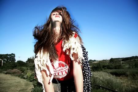
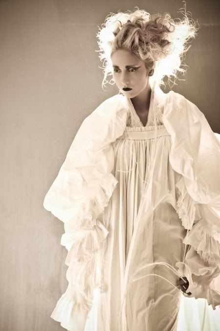
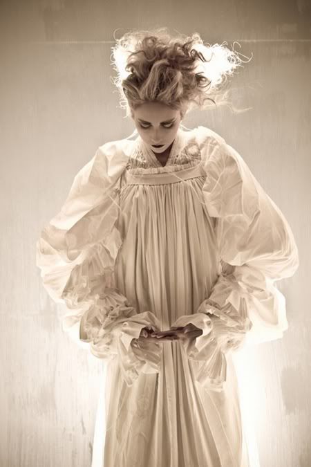
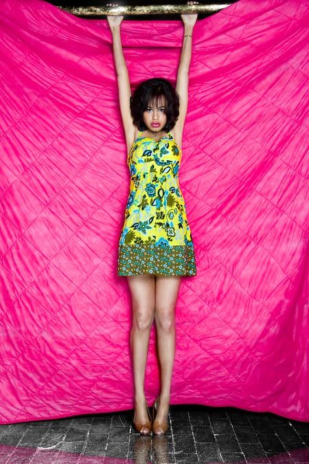
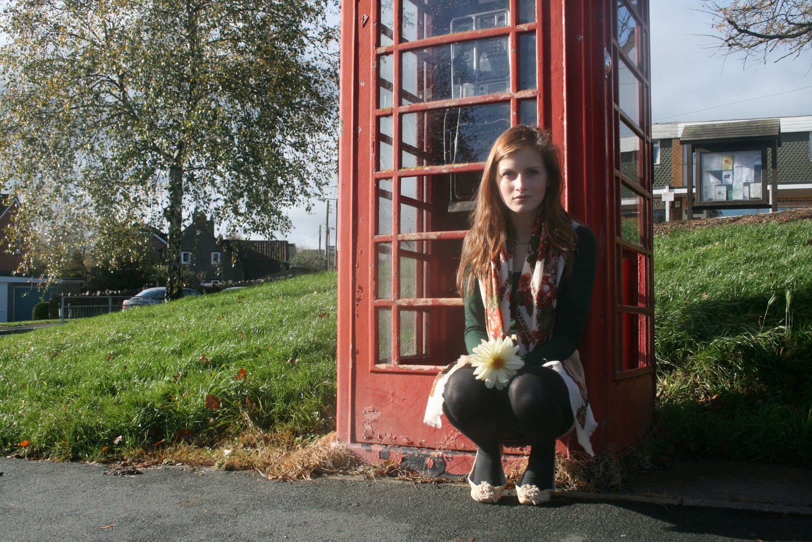
I think Eleanor Hardwick, Elena Marshall, David Bailey and Peter Wormleighton are my main inspirations, I know I don't make this very clear in my shoots but they have been a major factor in developing my ideas. David Bailey is also a key figure in my extended writing along with the boutique biba.
I feel a lot more confident using my DSLR manually now, and am happy to use it on pretty much any setting and still produce successful images, I think the next important thing on the shopping list is a good tripod as its hard to find completely steady surfaces while using a long shutter speed. I would also love a film SLR, I had a few problems with the first film shoot I took, every images came out black meaning it was all over exposed however the dividers between the frames were still black so I'm guessing it's a camera fault rather than changing the film (my holga doesn't rewind automatically, you have to use a lightproof bag). The second shoot I took was experimenting with double exposures with my vintage bike (the one I plan to use in my final shoot) but the same problem happened. Third time lucky, I borrowed a film SLR and the most bizarre thing happened. Someone had already used the film but put it back in the canister with the tongue still out so I took my shoot over the top, this created the double exposure idea I wanted to try however it would normally be impossible to try on a SLR. In my final shoots if I have time I would like to experiment more with double exposures and theres a technique where you put the canister in the washing machine before you develop it and the heat chemically changes the film, this seems a nice experimental technique to try.
Fashion and portraiture is going to stay as my main theme and composition but Im going to be experimenting with more vintage techniques. I'm hoping to get a polaroid sx 70 for christmas which would be perfect for creating those lovely aged, dreamy style images however there are also lots of editing programmes and software which can be used.
I'm really bad at annotating my work, but the majority of my images are edited on photoshop, iphoto or picnik.com however I have tried using gimp once or twice while my photoshop was down. On picnik I use the cross process tool, 1960s effect, added grain, sepia, black and white, colour curves etc. I have also started adding my name to my work, this was my dads idea as a cross between advertising, copy-write and watermarking my work. I use iphoto if I want to really briefly retouch an image for example just increase the contrast a little or reduce the saturation however photoshop is the opposite. We have photoshop elements at school whereas on my macbook I have photoshop css which I use if I want to extensively edit images. A lot of my images I layer on top of each other and convert the top layer to black and white, and then erase the background to leave the figure in greyscale or use colour curves or the filters. I also use dodge and burn quite a bit to emphasise areas of interest and also the clone tool sometime on models skin to created a more airbrushed effect (very controversial topic).
I've mentioned illustration quite a bit and looked into a few artists however I haven't introduced this into my own work yet, for my final shoots I would definitely like to develop this idea, however I have started thinking along those lines for example erasing models faces to leave space for cartoons or illustrations.
I feel a lot more confident using my DSLR manually now, and am happy to use it on pretty much any setting and still produce successful images, I think the next important thing on the shopping list is a good tripod as its hard to find completely steady surfaces while using a long shutter speed. I would also love a film SLR, I had a few problems with the first film shoot I took, every images came out black meaning it was all over exposed however the dividers between the frames were still black so I'm guessing it's a camera fault rather than changing the film (my holga doesn't rewind automatically, you have to use a lightproof bag). The second shoot I took was experimenting with double exposures with my vintage bike (the one I plan to use in my final shoot) but the same problem happened. Third time lucky, I borrowed a film SLR and the most bizarre thing happened. Someone had already used the film but put it back in the canister with the tongue still out so I took my shoot over the top, this created the double exposure idea I wanted to try however it would normally be impossible to try on a SLR. In my final shoots if I have time I would like to experiment more with double exposures and theres a technique where you put the canister in the washing machine before you develop it and the heat chemically changes the film, this seems a nice experimental technique to try.
Fashion and portraiture is going to stay as my main theme and composition but Im going to be experimenting with more vintage techniques. I'm hoping to get a polaroid sx 70 for christmas which would be perfect for creating those lovely aged, dreamy style images however there are also lots of editing programmes and software which can be used.
I'm really bad at annotating my work, but the majority of my images are edited on photoshop, iphoto or picnik.com however I have tried using gimp once or twice while my photoshop was down. On picnik I use the cross process tool, 1960s effect, added grain, sepia, black and white, colour curves etc. I have also started adding my name to my work, this was my dads idea as a cross between advertising, copy-write and watermarking my work. I use iphoto if I want to really briefly retouch an image for example just increase the contrast a little or reduce the saturation however photoshop is the opposite. We have photoshop elements at school whereas on my macbook I have photoshop css which I use if I want to extensively edit images. A lot of my images I layer on top of each other and convert the top layer to black and white, and then erase the background to leave the figure in greyscale or use colour curves or the filters. I also use dodge and burn quite a bit to emphasise areas of interest and also the clone tool sometime on models skin to created a more airbrushed effect (very controversial topic).
I've mentioned illustration quite a bit and looked into a few artists however I haven't introduced this into my own work yet, for my final shoots I would definitely like to develop this idea, however I have started thinking along those lines for example erasing models faces to leave space for cartoons or illustrations.